Onboarding Re-design

⏱️ 4 months for problem discovery, design iteraiton and final mocks
👩🏻 Me - lead product designer
👱 Product manager
🧑🏻 Lead front end engineer
⏳ Transformed a support-dependent onboarding process, improving customer retention by 23% & decreasing customer support hours.
🏋️ Established content writing guidelines for the whole company that significantly improved clarity, and reduced funnel drop-off by 16%.
🏃 Led standardization of onboarding & settings pages, defining reuseable patterns and components, decreasing design & development time by ~30%.
Intro
Pay Finder: our existing product
To use our product (Pay Finder), customers upload sensitive employee salary data which powers a data visualization and pay consistency recommendation.
Recruiters and compensation analysts use the recommendation when determining a starting salary for a new hire or incumbent employee.
At this time, we relied on our customer success team to onboard customers. Customer success uploaded data and configured the recommendation while the customer watched.
This didn’t scale, and the process was so confusing that customer retention was low.

Intro
Proposing the project
The truth was our onboarding / set-up was very confusing because over the course of months, I added settings ad hoc.
Although these settings supported useful features, they were ultimately not addressing bigger concerns and points of confusion during onboarding.
Myself and the lead front end engineer partnered to improve these pages.
We identified our goals as:
- ⬇️ Decrease customer success hours getting customers set-up
- 🔼 Increase users in our product
- ⬇️ Decrease development time for this project and future projects
And we initally categorized the problems with these pages into two buckets:
- 😭 Design and tech debt:
Many elements were not componetized; developers had to build them from scratch and they were difficult to keep stylistically consistent. - 😵 Too complex and confusing
Set-up was difficult to navigate and hard to understand. We had no framework for adding new settings, which made the interface jumbled and confusing.
Feature creep left the interface cluttered, text-heavy and confusing
Research
Problem refinement through research and collaboration
After we got approval from leadership to tackle the project, I begin by refining the problem space through research and collaboration.
1️⃣ First, I took screenshots and documented important flows in Figjam, then adding my own notes for improvement.
2️⃣ Next I held two, quick virtual brainstorming sessions using Figjam with with Customer Success.
3️⃣ Then I did a brainstorming session with our own development team.
4️⃣ Finally, I analyzed and synthesized what I found.
More than just refining problems, these sessions drove alignment on ideal outcomes across teams. It helped us to move faster since customer success had weighed in on the outcome and was invested in its success. Our development team also had a better understanding of why we were tackling the project and wanted it to be successful.
You can take a closer look at the Figjam here 🙂

Problem
Expanding impact
Through research and collaboration, I realized that I could extend the value of this project across the entire company.
I conducted an audit of all the other set-up pages in our products and confirmed that the lack of consistent design patterns had created inconsistencies in layout, component usage, and visual style across our product ecosystem.
This was a great opportunity to standardize and componentize these pages for faster development in the future.
solution
💢 Reducing information overload
There were only two pages used for set-up: “General Settings” and “UI Customization”.
“General Settings” was intended to include the minimum steps for set-up, but over time additional settings had made their way in.
“UI Customization” allowed the user to customize the two different views—the “admin” view, and the more limited “recruiter” view.
However as we added more and more settings over time, it became confusing as to which setting applied to which view.
We needed a new information architecture that would make things easier to navigate and understand.
Also, we planned to add more set-up features in the future, so my solution needed to be flexible and scalable.

So, with the help of customer success, I mapped out the ideal set-up flow:

Then, I mapped each current and planned function on virtual cards in Figjam, then came up with two different information architecture ideas based on the onboarding workflow that customer success used.
The Figjam allowed for experimentation and easy review with the customer success team, the design team, and my product manger and front end lead.

✅ Finalizing Information architecture
After feedback, I landed giving each set-up step its own page within a first-level nav.
The basic set-up steps wouldn’t change, so the navigation would stay simple.
I changed UI Customization into View Configuration, which made it clear that this is where users could set up a view.
Each view became a sub-tab under View Configuration. This allowed us to add more views over time, and charge for them.

✅ Finalizing the new navigation
I used the using the existing navigation component. Since we wanted to reduce design and development time, this was a perfect trade-off against designing a brand-new onboarding experience from scratch.
Also, at this point onboarding and set-up was only done by customer success, so even this intermediary step would be an improvement.
The existing navigation component surfaced all steps, so users could easily follow the flow or find a step out of order and return to it.
Using an existing component also allowed me to focus on other parts of the design that were more essential, and allowed the development team to move faster.


solution
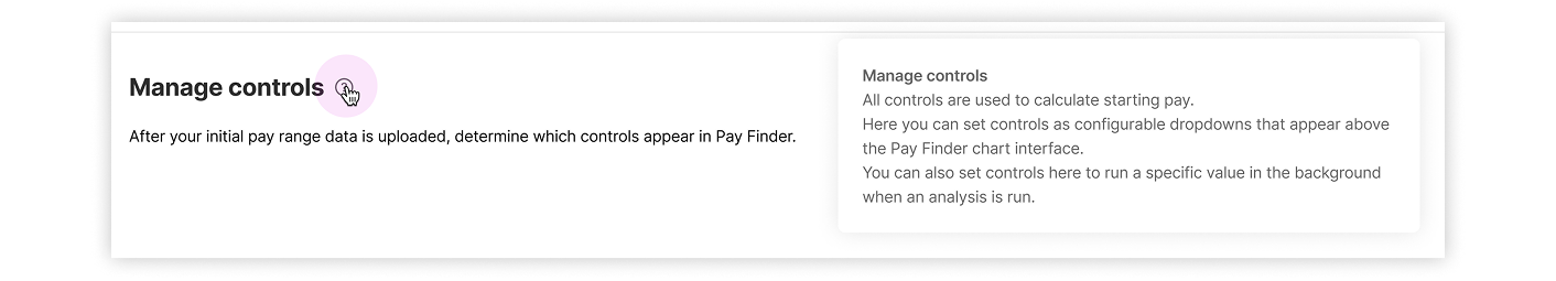
🎓 Improving clarity and providing education
Updating the navigaton and providing each view its own page resolved confusion over which setting applied to which view.
But the ranges on the chart had unfamiliar names and represented abstract concepts. Users would need to understand these concepts when configuring a view.
I wanted to create a design that would help educate without relying on too much text or help articles.
I felt illustrations would be helpful so I created one for each view, and designed small illustrations of each range next to the setting that configured it.

✅ Tooltips - balancing clarity with development effort
I explored a few versions of this idea, but we chose to implement this version below. Here, the tooltips persist when the uer clicks the info icon. This design educates users on each chart element without being obtrusive and keeping the interface clean and minimal.
This made the interface much easiser to understand, which decreased reliance on customer success.
This pattern was scalable to all the other onboarding / set-up pages across our product suite. And, it didn’t introduce any new components which reduced development time.
The illustrations were simple and quick to create. This would be handy when we added to or changed the chart.

Though stakeholders and our lead front-end developer favored this approach for clarity, it would’ve required a new third-level nav pattern we didn’t have. Also, the state management between pages would’ve been more complex.

This approach is very similar to the design we implemented, but doesn’t utilize tooltips as effectively.

Solution
✏️ Improving content & creating guidelines
Settings were divided into sections on a page, and each section had a large paragraph of text, multiple tooltip explainers, and links out to lengthy help articles. It was informationally dense. Moreover, did not follow best writing practices for clarity and brevity.
Using my past experience as a legal writer and best practices for writing for the web, I rewrote the explainer text for each section.
I also created a series of content writing guidelines including:
Paragraphs should have no more than 3 sentences.
Avoid jargon and product specific terms, except where it is necessary to understand what is being configured. If product specific terms are appropriate, make sure they are defined.
With the design team, we decided that tone should be informational and reliable, not too friendly or familiar, since the subject matter (pay consistency and equity) was a serious one, and we wanted users to trust us.

final deliverables
Iterative releases and working with developers
Assigning prioritization
I worked with the product manager and front end lead to prioritize the design work. Not everything that was designed made it to release. We prioritized based on what would give users the most self-service ability, balanced by engineering effort.
Break down into smaller chunks
Once we had decided what we would build, we broke the work into four iterative chunks with product and engineers. I created final mocks with annotations for each one so it was clear for engineering.
Final product: