

News Storylines
Partnering with the data science team to design a dashboard that showcases news and lawsuits.
.png)
This new feature is called News Storylines. It's a dashboard that helps business development professionals find new clients and stay updated on existing ones.
After we identified that we wanted to create a dashboard that showed connections between news and litigation, I went through a rigorous process of identifying and testing assumptions, design iteration, interaction design and visual refinement.
Problem
Business development professionals visit many different websites to stay informed about current and potential clients—and this takes a lot of time.
Our team conducted generative research that indicated that these users would really benefit from a product that streamlined this process.
We also had access to several data bases from which we could pull news and litigation information, so we needed to figure out which databases would best solve the problem.
As the solo designer on the project, I had to come up with an intuitive interface, and develop new patterns and interactions.
Solution
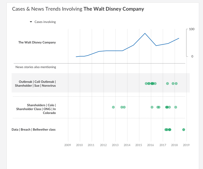
With our dashboard, a user can search for a client and find all the relevant news and litigation in one place, organized into groups that tell a story.
Each group links to related litigation (the orders, opinions and dockets) that arose from each group of stories.
There are two types of graphs for each group of stories: a histogram that shows the volume of news stories by month, and an expandable timeline graph below that reveals correlating lawsuits and litigation.
On the right side of the page, users can dig deeper into each news story or lawsuit.
.png)
My Contribution
I synthesized existing research and created personas and a user journey to help define the problem. These artifacts kept us on track when making design and data science decisions later on.
I created 10 data visualization concepts (using real data sets), working in partnership with our data scientist.
I built two prototypes using Invision to test the two best concepts with users.
I utilized my expertise in the industry to form and test hypotheses that directly informed our product roadmap.
I wrote a test plan that guided our design and data science strategy, and identified an alternative data source that solved our users' problem better than what we initially planned.
Proto-Personas & User Journey
I synthesized existing research to create two proto-personas, the Law Librarian and Law Firm Partner.
The law firm partner targets and develops relationships with clients. The law librarian is the one directly interacting with our product to pull client reports for the law firm partner.
These personas made it easier to articulate the challenges our users faced and helped the team focus on solving them.
Proto-Personas


Brainstorming Use Cases & User Flow Map
With the data scientist, I brainstormed some potential data we could tap to solve our users' problem of staying informed on current and potential clients.

Then I put together a quick flow map showing how the user would reach our product.

Ideation
The data scientist and myself hypothesized that putting news articles and lawsuits together would help users make sense of the issues a client was facing, but it also presented some unique design challenges.
How do you visualize a graph of aggregated news articles that are supposed to tell a story?
How do you show a graph of news articles and a graph of litigation events side-by-side, without confusing users?
How do you create a graph that tells a story AND accounts for massive variability in quantities? (5 news stories vs. 50?) And still is meaningful to interact with and look at?
Exploring Data Visualizations
First, I surveyed the literature on data visualizations, and then used that as a basis for extensive ideation.
Below are some examples, but I actually created about 10 different visualizations using different types of graphs.
.png)

Dots & Bars
After exploring and reviewing the concepts I came up with, the data scientist and myself decided either the dot graph or the histogram were the best ideations to represent the number of news stories per theme.
Each had pros and cons:
The dots worked well when there weren't very many, but if many were layered on top of each other, it would be difficult to ascertain their exact number.
The histogram was more intuitive, but we were also using a histogram for the litigation chart. We feared it would be confusing since the Y axis values of each chart were different.


Designing a Flow
Using two different designs--one with dots and one with a histogram--I developed a flow and created two prototypes using Invision.

User Interviews for Testing Assumptions
We conducted six test sessions with firm partners who researched news related to clients.
Below are some of the assumptions we tested, and how we iterated on the feedback.
Litigation Event Graph
The dashboard contained a graph with "litigation events," but we hadn't totally defined what a "litigation event" was. We also had databases of various types and quality that could potentially populate this graph.
Of these, one data set used the "final decision" in each case as a single data point. From a data science / engineering perspective, this was the natural choice because this database was already regularly utilized and adapted for API pulls.
However, I pressed us to look at the alternative of using "dockets" (i.e., a timeline of the case) instead of simply the "final decision," and did some design ideation to explore how a docket graph might look.
.png)
In testing, users overwhelmingly preferred a graph of dockets to a graph of final decisions.
In researching available data sources with dockets, I was able to point the data scientist to a source we hadn't looked at before, which linked dockets to news articles.
This was enough to push the product strategy towards utilizing a docket database.
This realization made a big difference in the final design:

Instead of a histogram showing the amount of "final decisions," we instead showed a docket timeline, with dots representing big events along the case history.
Representative Headlines vs. Keywords
Each group of news stories needed a title to explain the content within.
With the data scientist, we brainstormed two different solutions that we tested with users: keywords and representative headlines.
I incorporated both into the prototypes for testing.


Users were split 50/50, with some users preferring keywords and some preferring headlines.
"You can quickly scan words, but it takes a lot to read headlines."
"Keywords don't tell me enough, I think I prefer headlines."
What to do? Well, we found a way to give users the best of both worlds.
We used an algorithm to create "noun phrases."
So, instead of "Outbreak, Coli Outbreak, Shareholder, Sue, Norovirus" or "Chipotle Closes 43 Northwestern Stores Amid E. Coli Outbreak", users saw "Chipotle Store Closures from E. Coli."
Interaction Design & Testing
After iterating from the feedback, I began to design the interactions from the graph.
For this I used Principle, and explored lots of different ideas before landing on the below:

Hovering over a bar prompts a tooltip that gives some insight into the graph’s content.
Here, when the user hovers over the first bar, we can see it shows that two articles of this storyline were published in 2015.
Clicking on the bar highlights the corresponding news article on the right. The highlight remains until the user clicks again.

Many storylines give rise to litigation.
Here, the storyline tells us the entire story-arch of Chipotle’s battle against an overtime suit.
Clicking on the “see related litigation” button exposes each case in the form of a timeline. The right side changes to show details about the related litigation instead of news articles.

Clicking on the “see related litigation” button exposes each case in the form of a timeline.
The right side changes to show details about the related litigation instead of news articles.
Quick & Dirty Usability Testing
As per usual, time is a factor. We didn't have the bandwidth to test these interaction with actual users, so I found some volunteers around the office (first making sure that they had no idea what News Storylines was!).
Fortunately, users were successful in completing the tasks I gave them with these interactions. There were a few little tweaks, but overall we were ready to finalize the wireframes.
Final Design
.png)
.png)
.png)
My Impact & What I'd Do Differently
This was the first time I led UX on a project and it was a bit of an accident. After the more senior designer I worked with left the company, I had to quickly get up to speed and fill his shoes.
To that end, I gave this project 100%, and used my collaborative and analytical skills to really improve the final outcome. Myself and the data scientist basically did it on our own--with little input from product until the final stages.
While this was a great experience, there are many things I'd do differently. For example, I wish I would've collaborated more with engineers early on and gotten more of their feedback on my designs.
And--although I did meet with other, more senior designers from time to time--I wish I would've done that more. I think that could've made the design more simple and intuitive with their input.
But on balance, I learned a lot.
Ultimately, this feature was written up in a couple legal blogs as one of the most exciting analytics offerings in 2019. I'm definitely pleased with that!